该模块定义了一组层级化的 ftxui::Element 。一个元素(Element)可以管理布局,并且能够响应终端尺寸的变化。请注意以下示例,其中该模块被用来通过若干操作符创建一个简单的布局:
示例
namespace ftxui {
    ...

// 定义文档
Element document = vbox({
  text("The window") | bold | color(Color::Blue),
  gauge(0.5)
  text("The footer")
});

// 添加边框,通过调用 `ftxui::border` 装饰器函数
document = border(document);

// 添加另一个边框,使用管道操作符
document = document | border.

// 添加另一个边框,使用 |= 管道操作符
document |= border

...
}
元素操作列表
所有元素都已包含在内,可以通过包含对应的头文件来访问:
#include <ftxui/dom/elements.hpp>
// Copyright 2020 Arthur Sonzogni. All rights reserved.
// Use of this source code is governed by the MIT license that can be found in
// the LICENSE file.
#ifndef FTXUI_DOM_ELEMENTS_HPP
#define FTXUI_DOM_ELEMENTS_HPP
#include <functional>
#include <memory>
#include "ftxui/dom/canvas.hpp"
#include "ftxui/dom/direction.hpp"
#include "ftxui/dom/flexbox_config.hpp"
#include "ftxui/dom/linear_gradient.hpp"
#include "ftxui/dom/node.hpp"
#include "ftxui/screen/box.hpp"
#include "ftxui/screen/color.hpp"
#include "ftxui/screen/terminal.hpp"
#include "ftxui/util/ref.hpp"
namespace ftxui {
class Node;
using Element = std::shared_ptr<Node>;
using Elements = std::vector<Element>;
using Decorator = std::function<Element(Element)>;
using GraphFunction = std::function<std::vector<int>(int, int)>;
/// @brief BorderStyle is an enumeration that represents the different styles
/// of borders that can be applied to elements in the terminal UI.
///
/// BorderStyle is an enumeration that represents the different styles of
/// borders that can be applied to elements in the terminal UI.
/// It is used to define the visual appearance of borders around elements,
/// such as windows, frames, or separators.
/// @ingroup dom
enum BorderStyle {
LIGHT,
DASHED,
HEAVY,
DOUBLE,
ROUNDED,
EMPTY,
};
// Pipe elements into decorator togethers.
// For instance the next lines are equivalents:
// -> text("ftxui") | bold | underlined
// -> underlined(bold(text("FTXUI")))
Element operator|(Element, Decorator);
Element& operator|=(Element&, Decorator);
Elements operator|(Elements, Decorator);
Decorator operator|(Decorator, Decorator);
// --- Widget ---
Element text(std::string text);
Element vtext(std::string text);
Element separator();
Element separatorLight();
Element separatorDashed();
Element separatorHeavy();
Element separatorDouble();
Element separatorEmpty();
Element separatorStyled(BorderStyle);
Element separator(Pixel);
Element separatorCharacter(std::string);
Element separatorHSelector(float left,
float right,
Color unselected_color,
Color selected_color);
Element separatorVSelector(float up,
float down,
Color unselected_color,
Color selected_color);
Element gauge(float progress);
Element gaugeLeft(float progress);
Element gaugeRight(float progress);
Element gaugeUp(float progress);
Element gaugeDown(float progress);
Element gaugeDirection(float progress, Direction direction);
Element border(Element);
Element borderLight(Element);
Element borderDashed(Element);
Element borderHeavy(Element);
Element borderDouble(Element);
Element borderRounded(Element);
Element borderEmpty(Element);
Decorator borderStyled(BorderStyle);
Decorator borderStyled(BorderStyle, Color);
Decorator borderStyled(Color);
Decorator borderWith(const Pixel&);
Element window(Element title, Element content, BorderStyle border = ROUNDED);
Element spinner(int charset_index, size_t image_index);
Element paragraph(const std::string& text);
Element paragraphAlignLeft(const std::string& text);
Element paragraphAlignRight(const std::string& text);
Element paragraphAlignCenter(const std::string& text);
Element paragraphAlignJustify(const std::string& text);
Element graph(GraphFunction);
Element emptyElement();
Element canvas(ConstRef<Canvas>);
Element canvas(int width, int height, std::function<void(Canvas&)>);
Element canvas(std::function<void(Canvas&)>);
// -- Decorator ---
Element bold(Element);
Element dim(Element);
Element italic(Element);
Element inverted(Element);
Element underlined(Element);
Element underlinedDouble(Element);
Element blink(Element);
Element strikethrough(Element);
Decorator color(Color);
Decorator bgcolor(Color);
Decorator color(const LinearGradient&);
Decorator bgcolor(const LinearGradient&);
Element color(Color, Element);
Element bgcolor(Color, Element);
Element color(const LinearGradient&, Element);
Element bgcolor(const LinearGradient&, Element);
Decorator focusPosition(int x, int y);
Decorator focusPositionRelative(float x, float y);
Element automerge(Element child);
Decorator hyperlink(std::string link);
Element hyperlink(std::string link, Element child);
Element selectionStyleReset(Element);
Decorator selectionColor(Color foreground);
Decorator selectionBackgroundColor(Color foreground);
Decorator selectionForegroundColor(Color foreground);
Decorator selectionStyle(std::function<void(Pixel&)> style);
// --- Layout is
// Horizontal, Vertical or stacked set of elements.
Element hbox(Elements);
Element vbox(Elements);
Element dbox(Elements);
Element flexbox(Elements, FlexboxConfig config = FlexboxConfig());
Element gridbox(std::vector<Elements> lines);
Element hflow(Elements); // Helper: default flexbox with row direction.
Element vflow(Elements); // Helper: default flexbox with column direction.
// -- Flexibility ---
// Define how to share the remaining space when not all of it is used inside a
// container.
Element flex(Element); // Expand/Minimize if possible/needed.
Element flex_grow(Element); // Expand element if possible.
Element flex_shrink(Element); // Minimize element if needed.
Element xflex(Element); // Expand/Minimize if possible/needed on X axis.
Element xflex_grow(Element); // Expand element if possible on X axis.
Element xflex_shrink(Element); // Minimize element if needed on X axis.
Element yflex(Element); // Expand/Minimize if possible/needed on Y axis.
Element yflex_grow(Element); // Expand element if possible on Y axis.
Element yflex_shrink(Element); // Minimize element if needed on Y axis.
Element notflex(Element); // Reset the flex attribute.
Element filler(); // A blank expandable element.
// -- Size override;
enum WidthOrHeight { WIDTH, HEIGHT };
enum Constraint { LESS_THAN, EQUAL, GREATER_THAN };
Decorator size(WidthOrHeight, Constraint, int value);
// --- Frame ---
// A frame is a scrollable area. The internal area is potentially larger than
// the external one. The internal area is scrolled in order to make visible the
// focused element.
Element frame(Element);
Element xframe(Element);
Element yframe(Element);
Element focus(Element);
Element select(Element e); // Deprecated - Alias for focus.
// --- Cursor ---
// Those are similar to `focus`, but also change the shape of the cursor.
Element focusCursorBlock(Element);
Element focusCursorBlockBlinking(Element);
Element focusCursorBar(Element);
Element focusCursorBarBlinking(Element);
Element focusCursorUnderline(Element);
Element focusCursorUnderlineBlinking(Element);
// --- Misc ---
Element vscroll_indicator(Element);
Element hscroll_indicator(Element);
Decorator reflect(Box& box);
// Before drawing the |element| clear the pixel below. This is useful in
// combinaison with dbox.
Element clear_under(Element element);
// --- Util --------------------------------------------------------------------
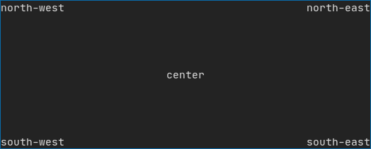
Element hcenter(Element);
Element vcenter(Element);
Element center(Element);
Element align_right(Element);
Element nothing(Element element);
namespace Dimension {
Dimensions Fit(Element&, bool extend_beyond_screen = false);
} // namespace Dimension
} // namespace ftxui
// Make container able to take any number of children as input.
#include "ftxui/dom/take_any_args.hpp"
// Include old definitions using wstring.
#include "ftxui/dom/deprecated.hpp"
#endif // FTXUI_DOM_ELEMENTS_HPP
Text
最简单且常用的控件,它用来显示文本。
text("我是一段文本");
我是一段文本
VText
与 ftxui::text 相同,但它是垂直显示的。
vtext("HELLO");
H
E
L
L
O
Paragraph
类似于 ftxui::text 但单词会根据容器的宽度自动换行到多行。
paragraph("A very long text");
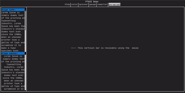
详细示例请查阅 官方演示
Paragraph 相关变体演示:
namespace ftxui {
    Element paragraph(std::string text);
    Element paragraphAlignLeft(std::string text);
    Element paragraphAlignRight(std::string text);
    Element paragraphAlignCenter(std::string text);
    Element paragraphAlignJustify(std::string text);
}
Border
在元素周围添加边框
border(text("The element"))
终端输出:
┌───────────┐
│The element│
└───────────┘
可以使用管道操作符实现相同的功能:
text("The element") | border
Border 也有不同的样式变体,如下所示:
namespace ftxui {
    Element border(Element);
    Element borderLight(Element);
    Element borderHeavy(Element);
    Element borderDouble(Element);
    Element borderRounded(Element);
    Element borderEmpty(Element);
    Decorator borderStyled(BorderStyle);
    Decorator borderWith(Pixel);
}
Window
ftxui::window 是一个 ftxui::border 但带有一个额外的标题,要在元素周围添加窗口请将其包装并指定一个字符串作为标题。代码:
window("The window", text("The element"))
┌The window─┐
│The element│
└───────────┘
Separator
显示一条分割线(垂直/水平),将容器内容一分为二。
border(
  hbox({
    text("Left"),
    separator(),
    text("Right")
  })
)
终端输出:
┌────┬─────┐
│left│right│
└────┴─────┘
其它变体:
namespace ftxui {
    Element separator(void);
    Element separatorLight();
    Element separatorHeavy();
    Element separatorDouble();
    Element separatorEmpty();
    Element separatorStyled(BorderStyle);
    Element separator(Pixel);
    Element separatorCharacter(std::string);
    Element separatorHSelector(float left,
                               float right,
                               Color background,
                               Color foreground);
    Element separatorVSelector(float up,
                               float down,
                               Color background,
                               Color foreground);
}
Gauge
一个进度条元素
border(gauge(0.5))
终端输出:
┌────────────────────────────────────────────────────────────────────────────┐
│██████████████████████████████████████                                      │
└────────────────────────────────────────────────────────────────────────────┘
Gauges 可以以多种形式显示:
namespace {
    Element gauge(float ratio);
    Element gaugeLeft(float ratio);
    Element gaugeRight(float ratio);
    Element gaugeUp(float ratio);
    Element gaugeDown(float ratio);
    Element gaugeDirection(float ratio, GaugeDirection);
}
Colors
在终端显示彩色文本和彩色背景,FTXUI 支持所有调色板:
Decorator color(Color);
Decorator bgcolor(Color);
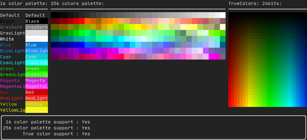
调色板 16
- Default
- Black
- GrayDark
- GrayLight
- White
- Blue
- BlueLight
- Cyan
- CyanLight
- Green
- GreenLight
- Magenta
- MagentaLight
- Red
- RedLight
- Yellow
- YellowLight
使用管道操作符使用上述颜色的示例:
text("Blue foreground") | color(Color::Blue);
text("Blue background") | bgcolor(Color::Blue);
text("Black on white") | color(Color::Black) | bgcolor(Color::White);
调色板 256
在支持256色的终端上使用
text("HotPink") | color(Color::HotPink);
TrueColor
在支持 TrueColor 的终端上,您可以直接使用 24 位 RGB 颜色空间
使用以下构造函数指定颜色的 RGB 或 HSV 值
有两个构造函数
ftxui::Color::RGB(uint8_t red, uint8_t green, uint8_t blue);
ftxui::Color::HSV(uint8_t hue, uint8_t saturation, uint8_t value);
LinearGradient
FTXUI 支持线性渐变。可以在前景色或背景色上使用。
Decorator color(const LinearGradient&);
Decorator bgcolor(const LinearGradient&);
ftxui::LinearGradient 由一个度和颜色停止点列表定义
auto gradient = LinearGradient()
  .Angle(45)
  .AddStop(0.0, Color::Red)
  .AddStop(0.5, Color::Green)
  .AddStop(1.0, Color::Blue);
也可以使用简化的构造函数:
LinearGradient(Color::Red, Color::Blue);
LinearGradient(45, Color::Red, Color::Blue);
详细演示
Style
除了彩色文本和彩色背景,还支持许多其它的文本样式,例如: 加粗、倾斜、下划线……
Element bold(Element);
Element italic(Element);
Element dim(Element);
Element inverted(Element);
Element underlined(Element);
Element underlinedDouble(Element);
Element strikethrough(Element);
Element blink(Element);
Decorator color(Color);
Decorator bgcolor(Color);
Decorator colorgrad(LinearGradient);
Decorator bgcolorgrad(LinearGradient);
要使用这些效果,只需用想要的样式包装在元素外边:
underlined(bold(text("This text is bold and underlined")))
或者直接使用管道操作符将其链接到元素上:
text("This text is bold") | bold | underlined
Layout
使元素能够以以下方式进行排列布局:
- 水平布局
ftxui::hbox - 垂直布局
ftxui::vbox - 网格布局
ftxui::gridbox - 沿着特定方向换行
ftxui::flexbox
使用 ftxui::hbox ftxui::vbox ftxui::filler 示例:
其它演示
元素也可以使用 ftxui::flex 装饰器变得更灵活
hbox({
  text("left") | border ,
  text("middle") | border | flex,
  text("right") | border,
});
终端输出:
┌────┐┌─────────────────────────────────────────────────────┐┌─────┐
│left││middle                                               ││right│
└────┘└─────────────────────────────────────────────────────┘└─────┘
hbox({
  text("left") | border ,
  text("middle") | border | flex,
  text("right") | border | flex,
});
┌────┐┌───────────────────────────────┐┌───────────────────────────────┐
│left││middle                         ││right                          │
└────┘└───────────────────────────────┘└───────────────────────────────┘
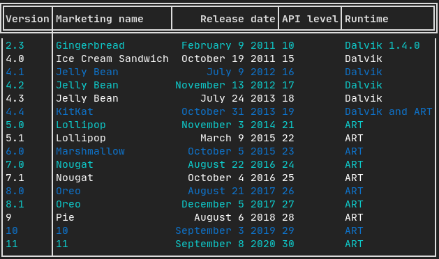
Table
能够轻松地将数据格式化为整洁的表格形式
// Copyright 2020 Arthur Sonzogni. All rights reserved.
// Use of this source code is governed by the MIT license that can be found in
// the LICENSE file.
#include <ftxui/dom/elements.hpp>  // for color, Fit, LIGHT, align_right, bold, DOUBLE
#include <ftxui/dom/table.hpp>      // for Table, TableSelection
#include <ftxui/screen/screen.hpp>  // for Screen
#include <iostream>                 // for endl, cout, ostream
#include <string>                   // for basic_string, allocator, string
#include <vector>                   // for vector

#include "ftxui/dom/node.hpp"  // for Render
#include "ftxui/screen/color.hpp"  // for Color, Color::Blue, Color::Cyan, Color::White, ftxui

int main() {
  using namespace ftxui;

  auto table = Table({
      {"Version", "Marketing name", "Release date", "API level", "Runtime"},
      {"2.3", "Gingerbread", "February 9 2011", "10", "Dalvik 1.4.0"},
      {"4.0", "Ice Cream Sandwich", "October 19 2011", "15", "Dalvik"},
      {"4.1", "Jelly Bean", "July 9 2012", "16", "Dalvik"},
      {"4.2", "Jelly Bean", "November 13 2012", "17", "Dalvik"},
      {"4.3", "Jelly Bean", "July 24 2013", "18", "Dalvik"},
      {"4.4", "KitKat", "October 31 2013", "19", "Dalvik and ART"},
      {"5.0", "Lollipop", "November 3 2014", "21", "ART"},
      {"5.1", "Lollipop", "March 9 2015", "22", "ART"},
      {"6.0", "Marshmallow", "October 5 2015", "23", "ART"},
      {"7.0", "Nougat", "August 22 2016", "24", "ART"},
      {"7.1", "Nougat", "October 4 2016", "25", "ART"},
      {"8.0", "Oreo", "August 21 2017", "26", "ART"},
      {"8.1", "Oreo", "December 5 2017", "27", "ART"},
      {"9", "Pie", "August 6 2018", "28", "ART"},
      {"10", "10", "September 3 2019", "29", "ART"},
      {"11", "11", "September 8 2020", "30", "ART"},
  });

  table.SelectAll().Border(LIGHT);

  // Add border around the first column.
  table.SelectColumn(0).Border(LIGHT);

  // Make first row bold with a double border.
  table.SelectRow(0).Decorate(bold);
  table.SelectRow(0).SeparatorVertical(LIGHT);
  table.SelectRow(0).Border(DOUBLE);

  // Align right the "Release date" column.
  table.SelectColumn(2).DecorateCells(align_right);

  // Select row from the second to the last.
  auto content = table.SelectRows(1, -1);
  // Alternate in between 3 colors.
  content.DecorateCellsAlternateRow(color(Color::Blue), 3, 0);
  content.DecorateCellsAlternateRow(color(Color::Cyan), 3, 1);
  content.DecorateCellsAlternateRow(color(Color::White), 3, 2);

  auto document = table.Render();
  auto screen =
      Screen::Create(Dimension::Fit(document, /*extend_beyond_screen=*/true));
  Render(screen, document);
  screen.Print();
  std::cout << std::endl;

  return 0;
}
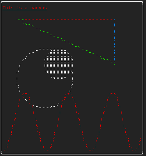
Canvas
可以在 ftxui::Canvas 上进行绘图
详细 API ftxui/dom/canvas